ShopDreamUp AI ArtDreamUp
Deviation Actions
The first contest DUALITY OF THE WORLD of  came to the end.
4 independent judges were invited
to help pick the winners
And now it's time to announce the winners!
I place
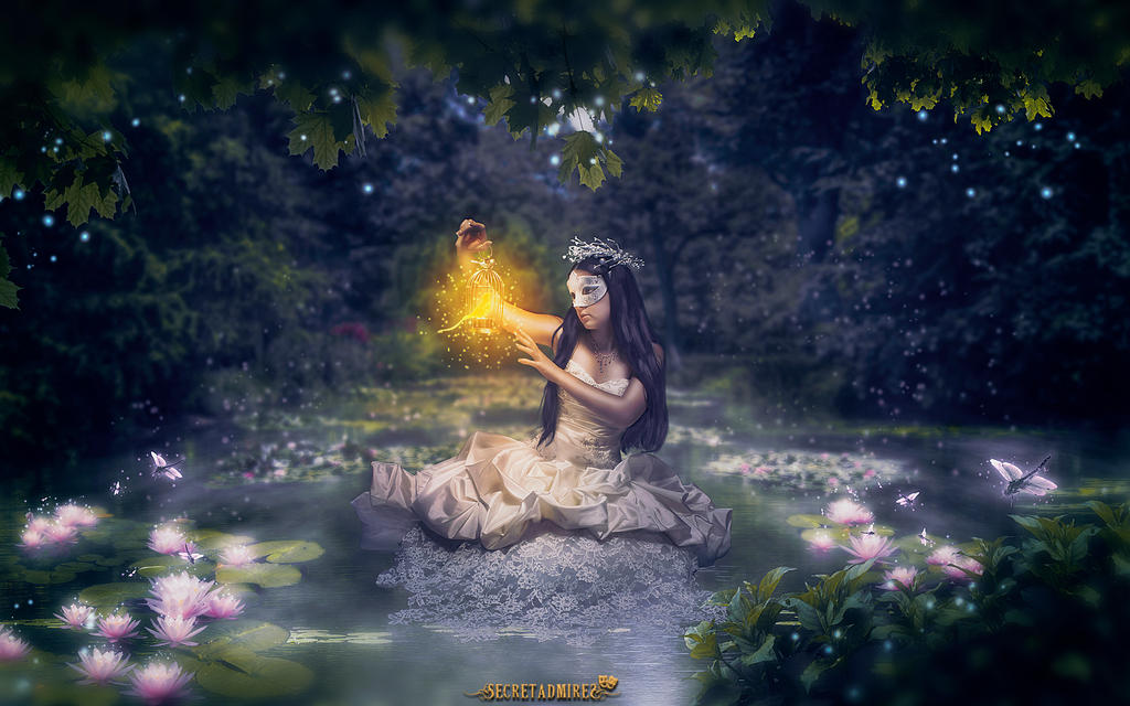
"World Of Contrast" by Secretadmires

Wesley-Souza: "A reality of our world, great concept."
ErikShoemaker: "Unlike most people, who interpreted the theme as two ladies with differently colored hair and dresses, this artist took a more challenging concept and executed it very well. This is why this artwork deserves the first place.
ErikShoemaker: "Unlike most people, who interpreted the theme as two ladies with differently colored hair and dresses, this artist took a more challenging concept and executed it very well. This is why this artwork deserves the first place.
Rowye: "Not exceptionally amazed by the execution but personally I think this is the artist who compromised the most with the topic. Something that a lot of people don't have the courage or will, to get their hands dirty."
II place
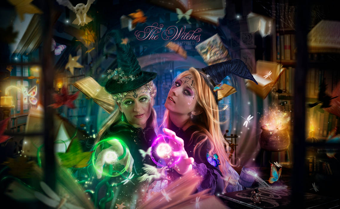
"Vida vs Muerte" by lauraypablo
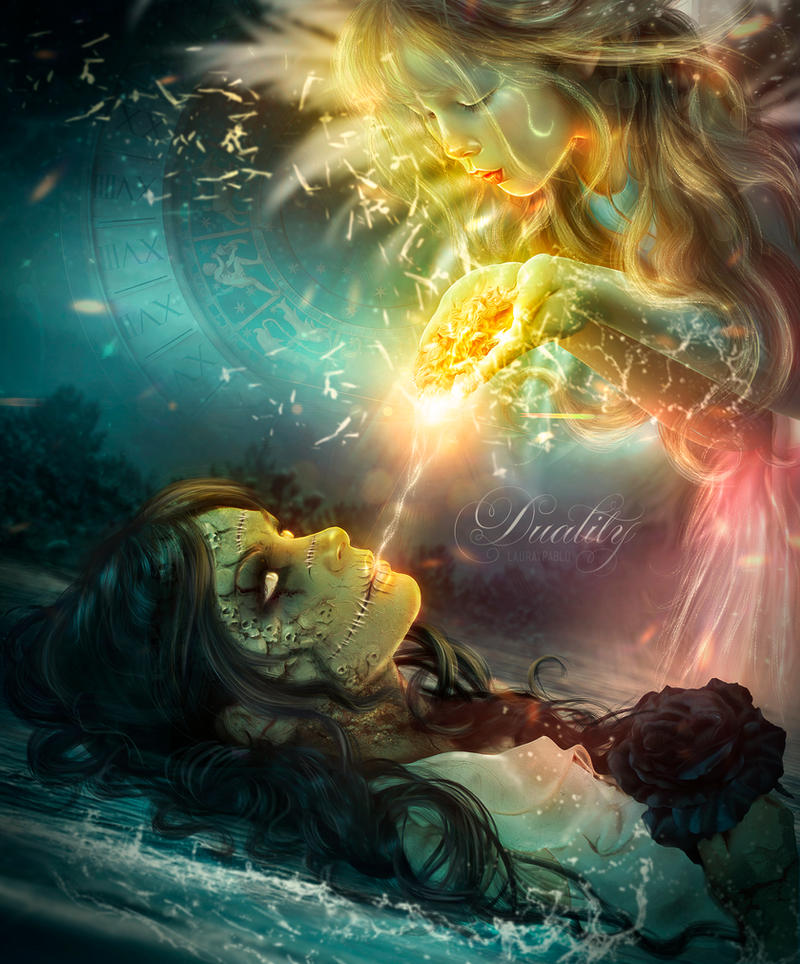
ErikShoemaker: "This is technically a bit sloppy but still visually striking thanks to the dynamic angle and perspective as well as the vibrant color scheme. This artwork gets my vote because out of the many entries it depicts the life-and-death theme in the most interesting way by showing the interplay between the two. The water splashes and effects could use some work. The face modifications are a bit rough but show that the artist spent some time and effort on executing her concept."
Rowye: "Just stunning and very in touch with the topic."
"Cross Paths - Good and Evil" by JayGraphixx
Rowye: "Just stunning and very in touch with the topic."
III place
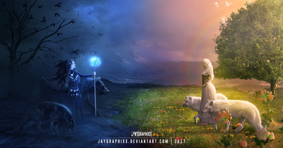
"Cross Paths - Good and Evil" by JayGraphixx
ErikShoemaker: "The concept is rather simple but the realization is clearly related to the theme. And the result is drop-dead gorgeous and perhaps in my opinion the most professional-looking entry in terms of technique, quality, light and coloring (e.g. the subtle light reflections on the backs of the wolfs (!), the smooth transition/blending in the grass, and the background haze). That's why this artwork also secures my vote.
Dani-Owergoor: "I really enjoyed this idea and the way was built, the scene was well planned and it really seems like both sides will fight a battle anytime now!"
Honorable mentions
"Rec(h)ess Time" by Cold-Tommy-Gin
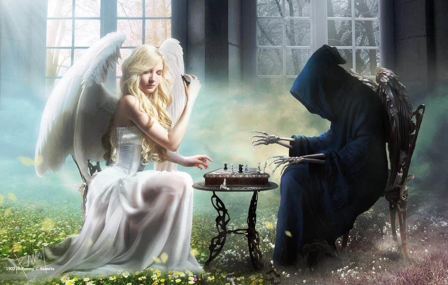
ErikShoemaker: "This elaborate manip is clearly related to the theme and shows the interplay between the two sides by having them play chess against each other, which for me is a nice touch to the theme. The blending is very well done and the result is striking due to the beautiful use of light. In my opinion the "death"-side falls a bit short compared to the stunning angel. The artist could have made better use of light and colors in this area. Furthermore the shadows and background are rather sloppy and could use some improvement. Still, worth my vote."
Dani-Owergoor: "Another great scene approaching two completely opposite beings. I consider the board as "life" and the pieces as the "humans" while good and evil hangs their eternal battle. Beautiful scene in balanced colors."
Wesley-Souza: "Good and evil having a fun time together, great concept."
"You Found Me" by Mr-Ripley

ErikShoemaker: "I really like this artwork (amazing light) and the concept is super creative, however, in my opinion barely related to the theme. The life-and-death theme is not really portrayed convincingly except for the skull."
Dani-Owergoor: "This is a very interesting concept of "life and death" and unlike anything I have ever seen. I could tell a story about "a little fish that hides "inside something dead" so as not to fall into the temptation of the seductive light of the Abyssal". Wonderful lighting."
"Angels" by vimark

"Mirror" by DanielPriego
Dani-Owergoor: "This is a very interesting concept of "life and death" and unlike anything I have ever seen. I could tell a story about "a little fish that hides "inside something dead" so as not to fall into the temptation of the seductive light of the Abyssal". Wonderful lighting."
"Angels" by vimark

ErikShoemaker: "Very clean and professional looking, but the theme relation is quite weak as it is only shown through the differently colored lances."
Dani-Owergoor: "The battle of "good vs evil" has been portrayed ever since, but when we see the concept so well applied, without excesses and working with a dramatic and balanced palette of colors, there is no way of not drawing attention!"
Rowye: "Visually my favorite of all, nice theme but mostly it just looks incredible."
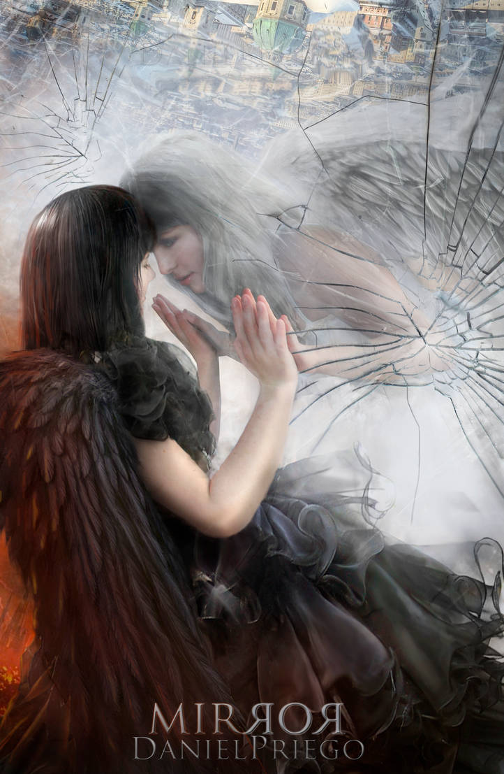
"Mirror" by DanielPriego
Rowye: "Very awesome transformation on the black dress model and I love the inclusion of the city at the top of the artwork."
CONGRATULATIONS TO ALL THE WINNERS!
<da:thumb id="449959149"/>
Other art from the winners:


I'm away!
On August 14, 2019, I will move to a very rural place far away from town where internet cable is not available.
I plan to live there for a year, maybe shorter or longer. I'm not sure yet.
Sooner or later I will move back to town and see you guys again.
If anyone want to contact me for any reason, I'll be unable to reply.
So please wait until I change my status.
Take care and good luck to you all my dear friends.
Until that day.
Best,
Mr-Ripley
Gratefulness from bed
Hello all my DA friends
On May 13th I accidentally had a serious problem with my back from carrying a heavy concrete stove on stairway alone. It causes me a great pain especially when I move. I couldn't do anything except keep lying in bed. It has been 9 days so far. I apologize everyone on DA for being uncomfortable to reply your notes and messages lately. Now the pain has subsided. I still can't go back to work yet but at least I can move to my keyboard and type.
And today I just found out that I have received my 6th DD with my work called Next Stop Wonderland
Thank you so much dear `lauraypablo (https://www.deviantart.com/lauraypablo) and :iconlora-vysotskaya: for making i
Feature Time! 16
Hello friends :heart:
How are you doing? I hope you all are fine. It's time for me to feature artworks around DA again. Let me begin with my new work "The Last Embrace". It doesn't look like my usual style I guess. It was made for a book cover contest, and I hope it will become a real book cover for a romance novel someday. :)
Now let's me show you wonderful works from some wonderful friends :)
Have a nice day everyone! :wave:
Feature Time! 15
Hello dear friends :wave:
I'm sorry for being quite inactive. I'm very busy this year. Hope you all are fine.
This is my first journal and the pic below is my 4th artwork in 2018
Hope you like it. :)
And I'd like to thank `Andorada (https://www.deviantart.com/andorada) and :iconwdwparksgal: for giving me Angel without Wings Award in June.It's my honor ! :hug:Also thank :iconlora-vysotskaya: for putting me in Monthly spotlight in Photomanip Newsletter August 2018
I appreciate your kind support my dear friends :hug:
Now I'd like to share you some wonderful artworks from some wonderful friends.
Have a nice day everyone :)
© 2017 - 2024 Mr-Ripley
Comments1
Join the community to add your comment. Already a deviant? Log In
So he deactivated his account?
